Culver's
Client Project| UX Design | Visual Design

Overview
I collaborated with design team to digitize Culver's in-store and drive-thru menu boards, replacing their static, paper-based menus.
Time
May 2025 - July 2025
Methods & Tools
User Design and Research Methods
Prototyping, Wireframes
Design Tools
Figma
The Challenge
Design indoor & drive-thru digital menu boards to improve the guest ordering experience
I worked as a UX Designer on the team and conducted a content audit of existing menu boards to identify opportunities for improvement. I collaborated closely with strategists and designers to understand research data and operational needs, and recommend ideas for better layout of the menus.
The Boards
The menu boards were:
-
Crowded text that caused complication in making a quick decision-making in high-pressure situations.
-
Lacking a clear hierarchy, making it challenging to find new or featured items
-
Primarily static and no ability to update for seasonal promotion.
-
The project was 5–8 week long that involved reviewing changes and making decisions quickly that hindered our ability to stay agile.

Drive Thru menu audit notes
Indoor menu audit notes

Research & Content Audit
To redesign the menu boards, we began by reviewing existing Culver's menu boards as well as competitors like McDonald’s, Dunkin’, and Subway. This helped identify common patterns in layout, information hierarchy, and guest flow across the industry.
We created a bucket of all the menu items and worked with the content strategist to understand which items are popular among customers and have a higher selling point.


Design Strategy
We designed menu boards with understanding the real-world limitations including how far customers are from the menu, minimum readable type size, legal disclaimers, and the size & number of screens.
Our main goals were to:
-
Increase readability and menu clarity
-
Create a modular design that works across drive-thru and in-store experiences
-
Utilize data to optimize content and layout
-
Ensuring the design "feels like Culver's"
Layout Requirements
Outdoor layout: 3 vertical 55" screens, customers in car at ~14 ft distance
In-store layout: 4 horizontal 55" screens, customers standing ~10 ft away


Layout Blocking
We explored two different layouts to understand how much space each menu item needs and which item needs to be a priority.
"Bookends" Layout
-
ButterBurgers are the cornerstone of the menu
-
Have logical meal building layout
-
Maximizes cross selling with kids' Menu directly next to dessert menu
"Center out" Layout
-
Keeps main items centralized-ish for optimal viewing from all registers
-
Kids' Menu comes first since kids typically order before parents
-
Updated version of legacy menus so it's more familiar to patrons

Designing the moodboards
After ideating on the layout for the menu boards based on the content, we started to dig in to creating components for the menu items.
We created a modular system that introduces visual hierarchy and simplifies each element on the board. We established a clean type hierarchy to improve scanability, allowing customers to quickly browse and focus on the sections that matter to them.


Themes & Moodboards
To explore different visual directions, our team built three distinct themes. We then applied each theme to a full menu mockup to help show the client how they would look in real world.
1. Classic for a Reason
-
Culver’s is a modern classic. Blue skies, fresh custard, and timeless American flavor. Like Levi's and Coca-Cola, it’s not retro; it’s enduring.
-
This concept leans into what already works but sharpens it with modern clarity and polish.

.avif)
2. Food is the Focus
-
Let the flavor do the talking. This direction modernizes the Culver’s look with cleaner layouts, more whitespace, and beautifully isolated food photography that makes the menu items the true stars.


3. Part of your Joy
-
Culver's is where joyful moments happen. After the game. After the recital. You showed up and so did your community.
-
This direction leans into the emotional side of the experience—family, connection, celebration—and invites more joyful colors and personality into the design.


Final Designs
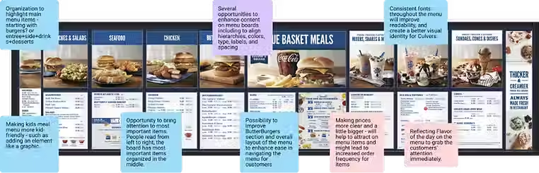
After reviewing the moodboards exploration with the client, our final designs ended up being a combination of all of them. Our new designs gave Culver’s a modern look and also reflected their brand.
New Drive-Thru Menu

New Indoor Menu

Reflection
This was the first time I worked on the menu designs and it presented some very unique challenges. One of the key things I learned that more space is not always the best to design. The indoor menu was where we experienced the most challenge as we had to include all items. This led to getting creative to make sure the layout stayed clear and navigable, even with all the content.
Overall, this project not only strengthened my technical skills but also enriched my capacity to design solutions that truly resonate with users, shaping me into a more thoughtful and versatile designer.